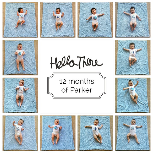
For this layout, I used the 12 monthly photos I took of Parker, with a Midnight edition card in the middle.
I went back and edited some of these monthly photos after I put together the layout in the app because after I saw all the photos together on a single layout, I could tell that they weren't all edited for consistency of brightness and lighting because I didn't edit them all together and I didn't necessarily take the photos at roughly the same time of day every time either. I finally got all the monthly photos edited to a place where I felt like they were sufficiently consistent month-to-month and called it good.
I love being able to see the progression of newborn to one-year-old on this layout, and wish I'd taken Evie's monthly photos all like this too. I plan to have this layout printed (maybe even extra copies for grandparents) so that I can include it in a physical album.

Some quick observations on the app:
- I found the app fairly intuitive to use, and I didn't personally run into anything buggy when I used it, though there were some that did.
- There are some features for the iOS version of the app that don't exist yet for the Android version - sending the layout to print from within the app, for instance.
- One feature that I thought could be nice, but isn't available, is being able to change the spacing width between photo slots.
- I think I've read others asking for the ability to edit photos within the app. I'm not sure that I would personally use that functionality much if it were there - I find it hard to edit photos on my phone.
